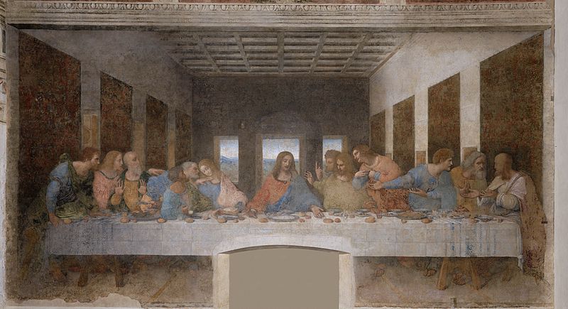
Leonardo Da Vinci first impressed me when one of my art history professors, while earning my MFA at Indiana University in 1963, described a certain spot in the room of “The Last Supper” as the ideal place for a viewer to stand. He explained that this was Leonardo’s visualization of the Renaissance concept of man as the center. This room at Santa Maria delle Grazie in Milan had not been intended as the monk’s dining hall but was converted to this purpose later, as it was traditional that a painting of the Last Supper would be in a refectory. If you stand in the center of the room and move back and forth until the orthogonal lines of the mural, those diagonal lines that pierce space and vanish in the distance, match those of the room itself then you will have found where Leonardo wanted you to stand. Could that truly be Leonardo’s designing? I traveled to Milan in 1964, found the spot and stood there amazed. Suddenly the space of the painting poured out into the space of the room. Standing at that little spot, like a host of people before me, I could see Renaissance thinking and understand the special significance of perspective to empirical thought and painterly form.
 [Leonardo Da Vinci, "The Last Supper" (ca. late 15th Century). Image via Wikimedia Commons]
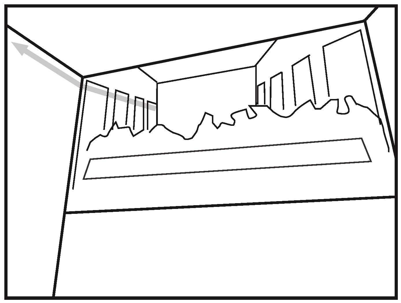
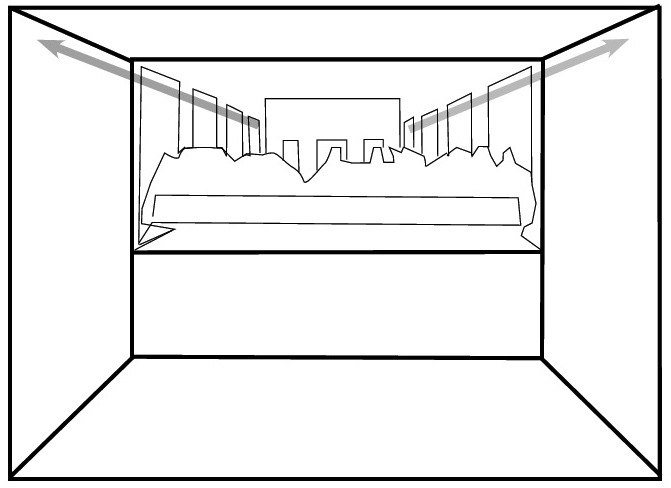
In order to understand how the space of the painting pours into the space of the room, the location of the painting needs to be identified. “The Last Supper” covers nearly two thirds of the upper portion of the end wall, reaching a designated level just below the ceiling, and fills the space between the two sidewalls. When the perspective in the painting becomes one with the perspective of the room we are in, then the sidewalls of the painted illusion become continuous with the sidewalls of the room. The windows in Leonardo’s painting thus become windows in the very room in which we are standing, while the tapestries in his painting seem to hang on the same walls that are to our right and left. Christ and his disciples appear to be dining on a raised platform in the refectory. Leonardo has merged real space with illusionist space—for an instant in time and space the surface of the painting becomes transparent and disappears. It no longer seems to be layers of gesso and tempera. The two accompanying line drawings make this clear. Figure 1 demonstrates the perspective as seen from the side, while figure 2 shows the continuous perspective between painting and room.
 [Figure 1. Standing to the side, the orthogonal lines of perspective are discontinous. Diagram copyright the author.]
 [Figure 2. Diagram copyright the author.]
As soon as we realize how Leonardo utilized the one point perspective to seemingly extend the space of the room, we know that he is making a formal comment about the surface of the painting. It is both a wall on which he lays gesso and tempera and also a surface that is transformed into thin air through the working of perspective illusion. No one can accuse Leonardo of being unaware of his forms; his “Last Supper,” which declares his planning with every aspect of its composition, contradicts any such doubt. Not least of these compositional effects is the placing of the single vanishing point right in the face of the central figure, Christ. Thus as we stand in the appointed spot our focus is directed to the central concept of not only the church and the city in which it stands but that of an entire social order.
Since my initial visit to “The Last Supper” at Santa Maria delle Grazie, I have had special respect for my neighbor on the Mediterranean pond. Although he is proclaimed Western and I am Arab, with a massive line drawn between us by Western discourse, I find that Palestine is closer to Milan than either Milan or Palestine to New York or London in the same way that I find myself closer to Leonardo’s scientific attitude than to the contemporary verbal acrobatics of Postmodernism.
After decades of artistic practice, I have realized that I learned a lot from Leonardo’s “Last Supper,” regarding the relationship of the surface of the painting to the illusion behind it; and simultaneously the relationship of its bounding edge to what is seen through it. In composing a painting, the relationship of its content to both the edge of the canvas, the surface of the canvas, and its depth are all to be considered and balanced. The picture’s surface (or as we painters call it, the picture plane) is a formal concept of primary importance. This formal concept includes not only the surface but also the normally rectangular edge of the painting. Together, these two components envelope the work of art and define its relationship to reality. The uses of the picture plane are varied and versatile.
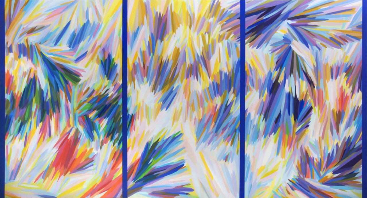
 [Samia Halaby, "Homage to Leonardo" (2012). Image copyright the artist.]
Fifty years after having found the spot where Leonardo might have wanted me to stand as a viewer, it was high time that I repay a debt and so I named a painting in his honor, “Homage to Leonardo” (2012). In naming Leonardo in my title, I am also pointing to the fact that abstraction was a part of illusionist painting and simultaneously that there is an illusion of depth in abstraction. The difference is that the space we make in abstraction is relative, indebted to the thinking that Einstein taught us; while the illusion of space in Renaissance painting and the paintings of Leonardo was a finite measurable space.
A sketch by Leonardo kept coming to mind as I was working on my painting. It was a pen and ink drawing of a flower on a page with other little sketches that I saw at an exhibition in London in 1966. If I remember correctly, it was a drawing in the British Royal Collection. What is important is that Leonardo shaded it as he normally did by using curved parallel lines indicating the cross-contours of its volume. At the end, he must have felt that he had made it too round and that it had popped out too strongly from the page. Thus he added a diagonal hatch over the entire sketch, applying a flattening effect. I could see his mind working and was startled by his determination to balance the surface flatness of the picture plane with depth even in a small sketch.
In “Homage to Leonardo,” I have made a large painting with many brush marks of varied color and light. Together, they create an abstract space of relative depth, light, and motion. I applied four navy blue vertical lines to assert the surface as Leonardo had done with his diagonal crosshatch. These four lines behave like the edges of glass panels in a large picture window through which we see the depth beyond. They assert a frontal surface, the picture plane, which seems as transparent as glass through which we see a world beyond.
Subject and content are significant in both illusionist and abstract painting, yet history honors Leonardo not so much for his subject matter, which was available in hundreds of pictures by enumerable artists, but rather for his formal genius, for his scientific attitude, for his knowledge of space and color, and for his use of pictorial abstraction. And of course for his refreshing treatment of a theme that had been and has been repeated thousands of times. It is satisfying to contemplate his work in this present time, where formal qualities are considered backward and the acrobatics of metaphor and verbal content rule the world of visual art, and where discourse on Postmodernist mixed-media is confusedly intermixed with painting.
[The above post is part of Visuals in 1500, a new Jadaliyya Culture series on aesthetics.]